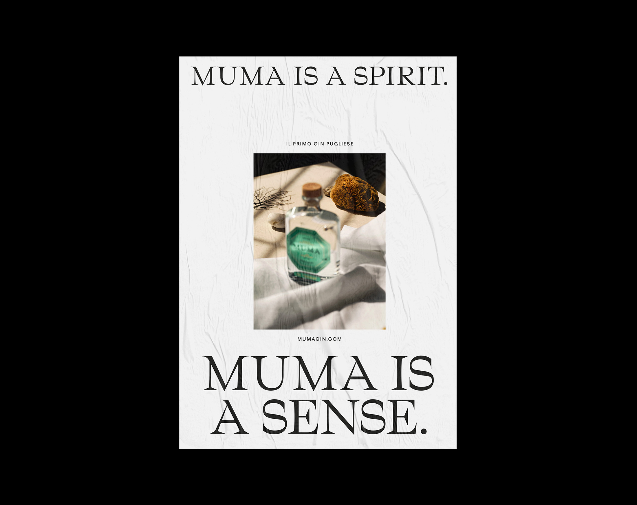
With a fresh, refined and free soul, Muma is the gin that embodies the Mediterranean lifestyle: sophisticated smells, strong sensations and an ongoing drive for freedom and discovery. The visual identity captures these features and brings them to a young international audience.
MUMA GIN
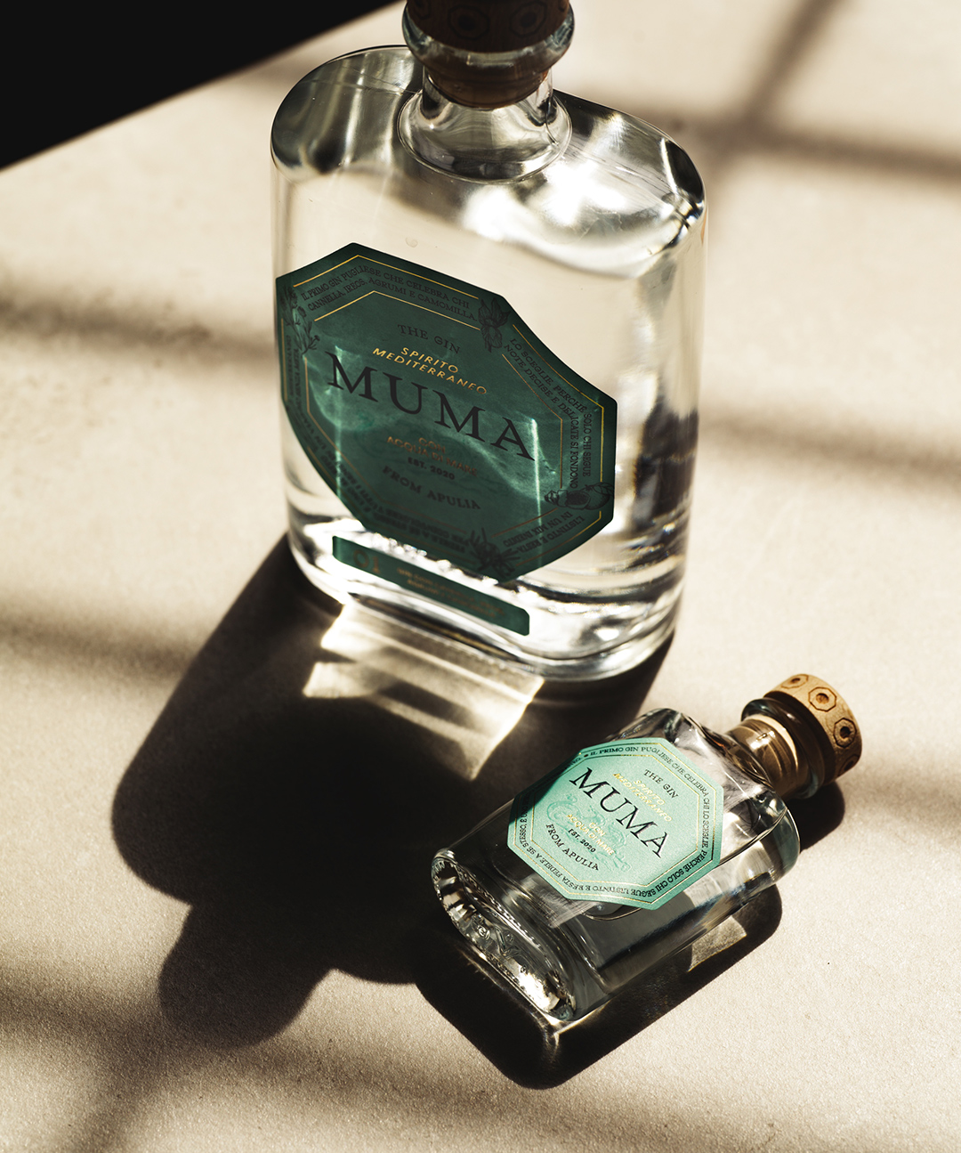
A strong yet delicate personality that engages all senses for the first Gin from Apulia, distilled using pure sea water.
brand identity, packaging
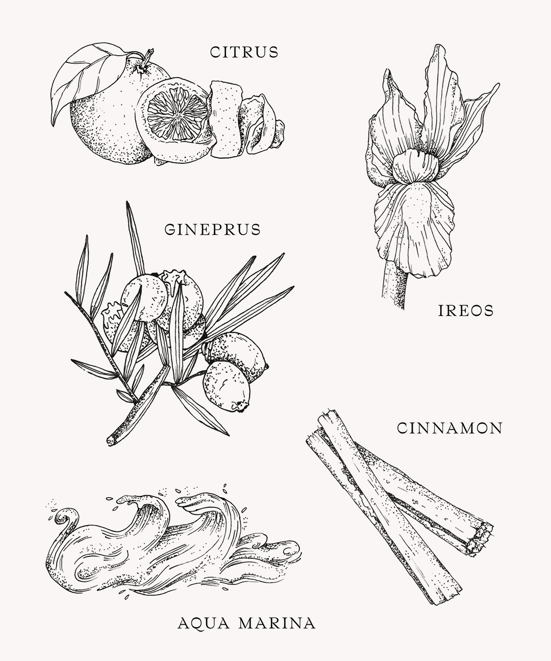
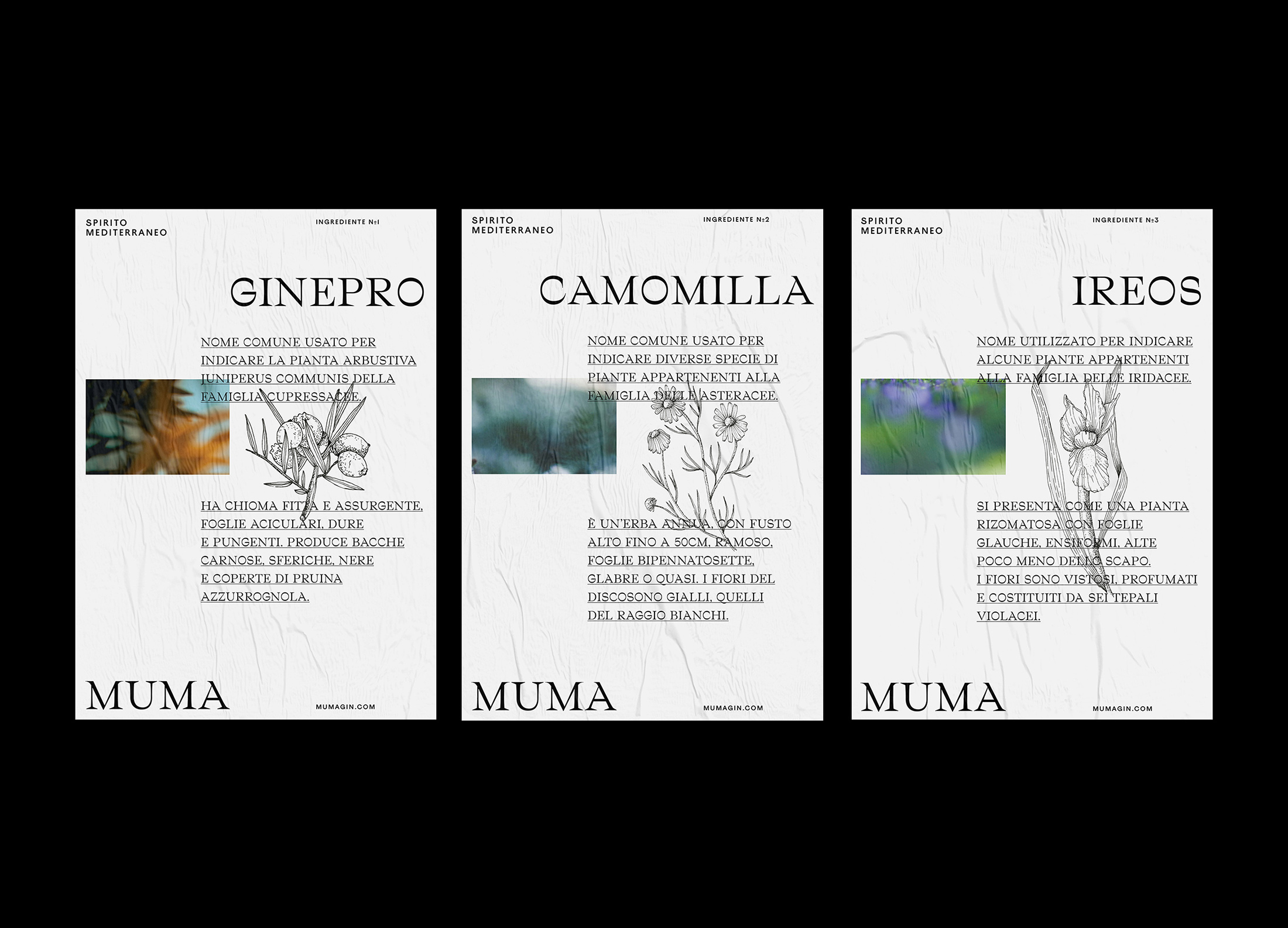
We created beautiful enciclopedic illustrations to add momentum to the ingredients list.
Muma is the will to experiment, the drive to discover the unknown, the desire of unique sensations.
DRAG
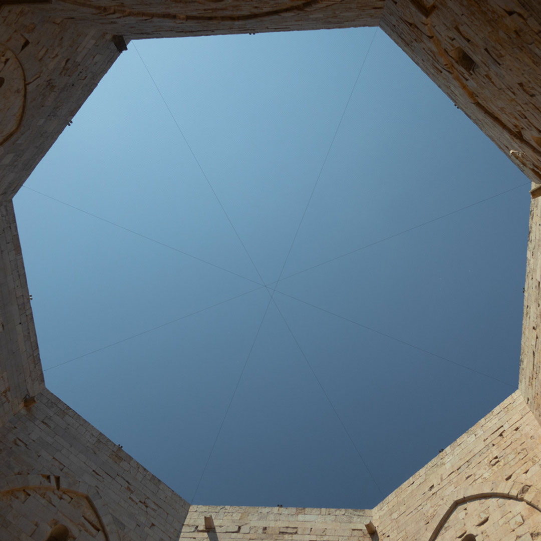
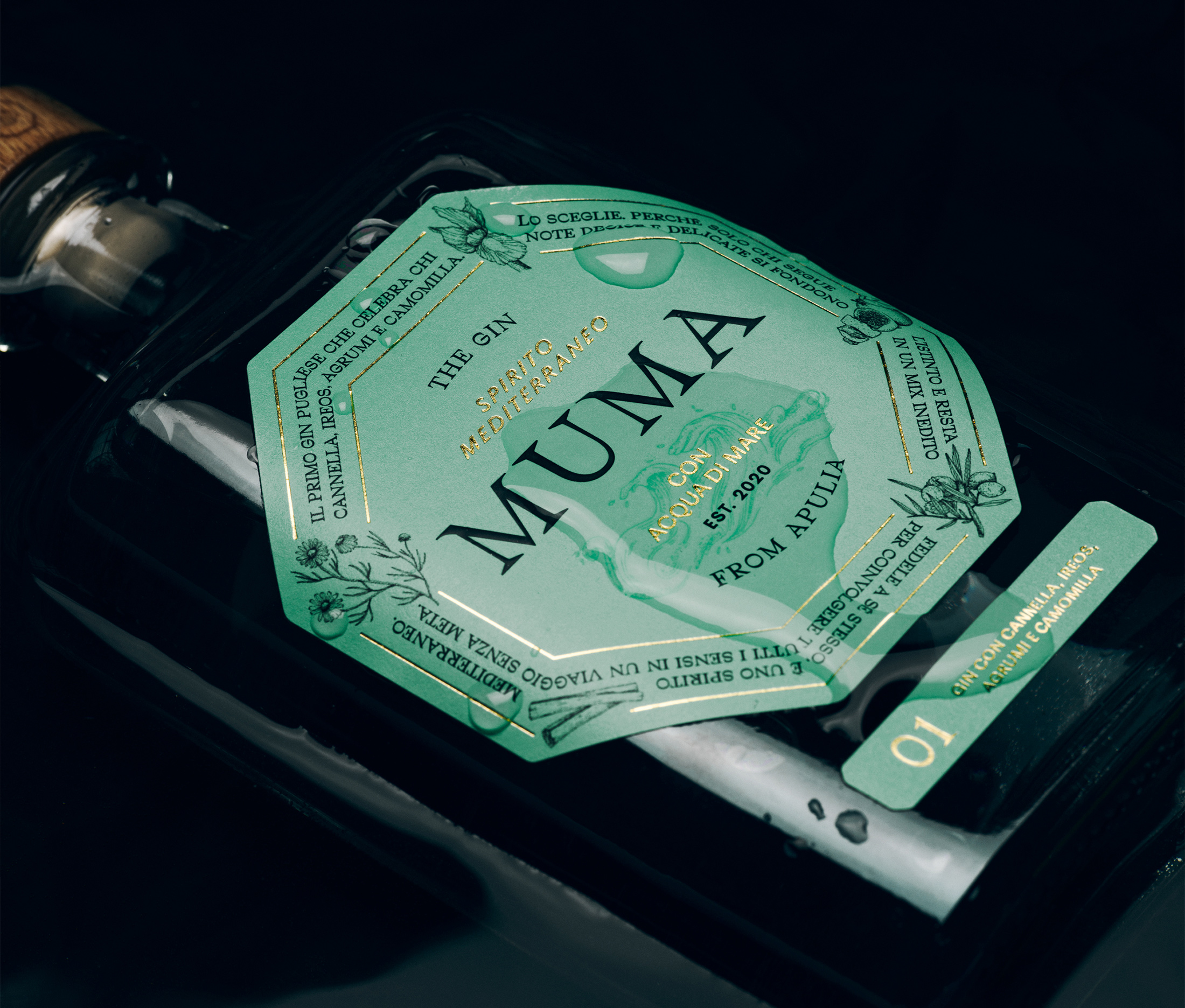
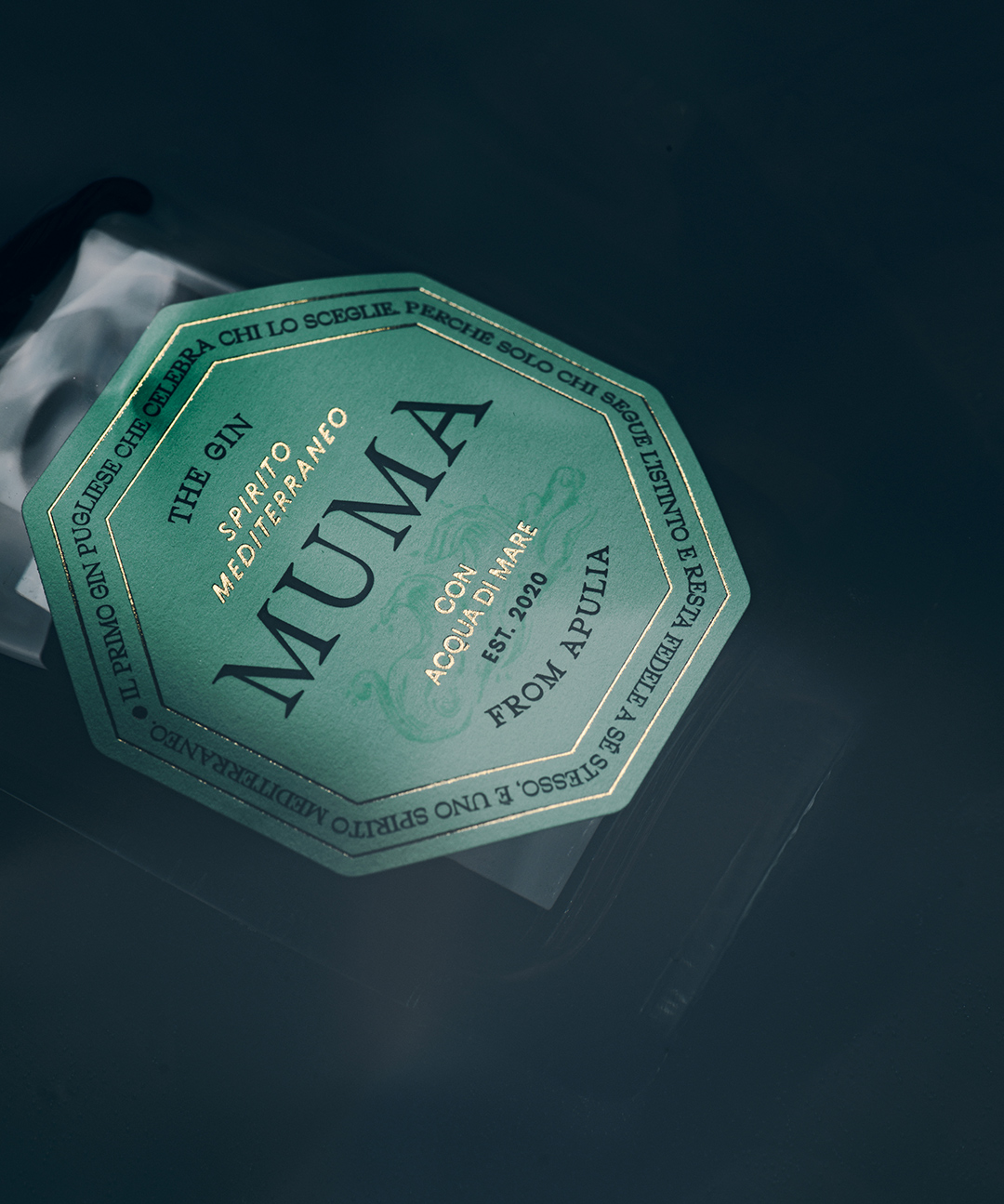
OCTAGONAL INSPIRATION
The label is inspired by the map of Castel del Monte, a Unesco site near the company headquarters.
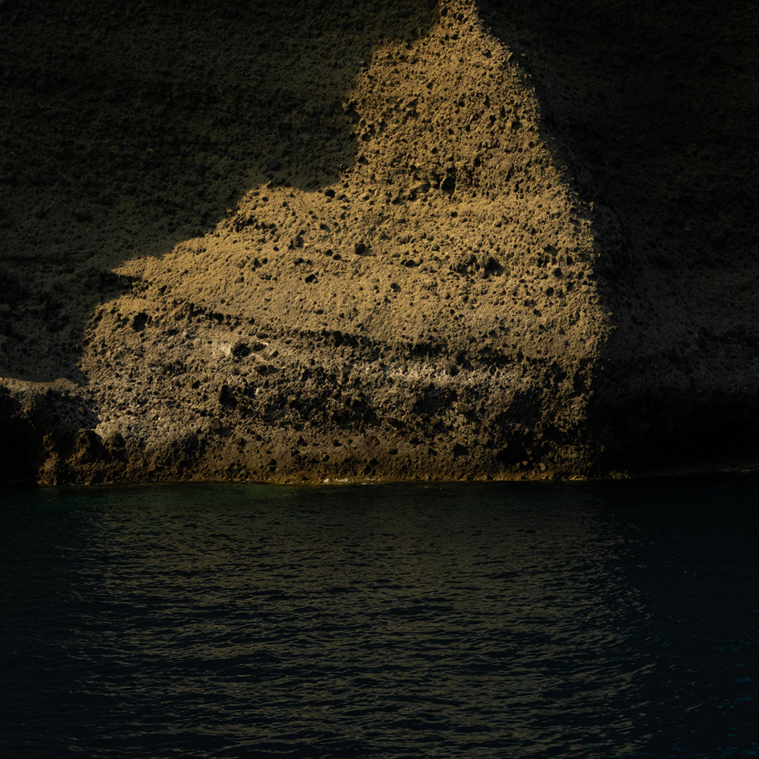
SEA OF MISTERY
The brand identity is a tribute to the spirit of adventure, mystery and sense of discovery that characterized centuries of navigation in the Mediterranean Sea.
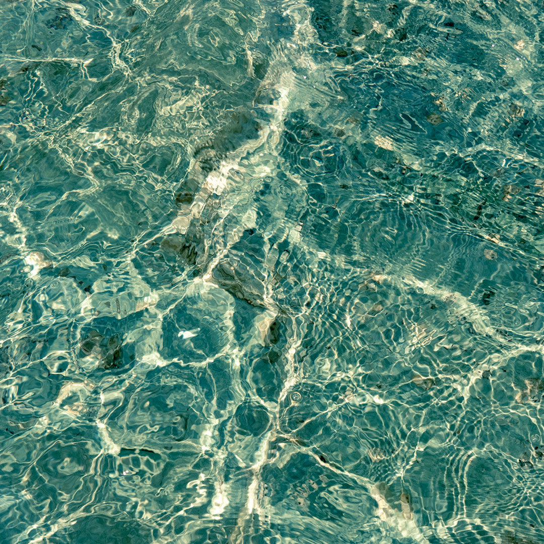
pristine water
the color of the label pays homage to the infinite shades of the clear Apulian sea.
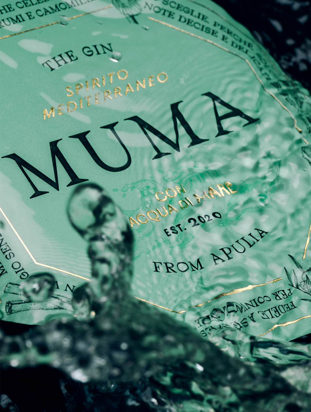
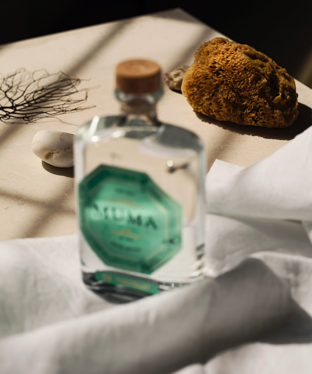
The product's key visuals were shot by us in our studio, recreating a nighty sea atmosphere.

The graphic elements create an iconic and recognizable label that materialize the refined soul of the brand.
KIM COSTANTINO, SENIOR DESIGNER
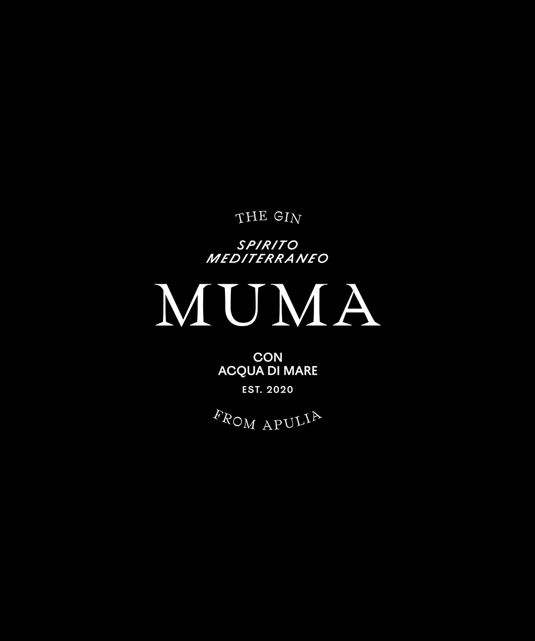
in the identity we designed for Muma Gin typography, photography and illustration are deeply connected.